#Block Types UIFREE
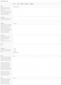
The Dynamic Block Types module allows you to register and manage ACF Block Types from your WordPress admin, in ACF > Block Types menu.
All ACF settings can be set within the UI. See ACF Block Types documentation.
A unique name that identifies the block (without namespace).
Note: A block name can only contain lowercase alphanumeric characters and dashes, and must begin with a letter.
This is a short description for your block.
Blocks are grouped into categories to help users browse and discover them. The core provided categories are [ common | formatting | layout | widgets | embed ]. Plugins and Themes can also register custom block categories.
Plugins and Themes can also register custom block categories.
An array of search terms to help user discover the block while searching.
One line for each keyword. ie:
quote
mention
cite
An array of post types to restrict this block type to.
The display mode for your block. Available settings are "auto", "preview" and "edit". Defaults to "preview".
Preview: Preview is always shown. Edit form appears in sidebar when block is selected.
Auto: Preview is shown by default but changes to edit form when block is selected.
Edit: Edit form is always shown.
Note. When in "preview" or "edit" modes, an icon will appear in the block toolbar to toggle between modes.
The default block alignment. Available settings are "left", "center", "right", "wide" and "full". Defaults to an empty string.
The default block text alignment (see supports setting for more info). Available settings are "left", "center" and "right". Defaults to the current language's text alignment.
The default block content alignment (see supports setting for more info). Available settings are "top", "center" and "bottom".
When utilising the "Matrix" control type, additional settings are available to specify all 9 positions from “top left” to “bottom right”. Defaults to "top".
Enable Anchor attribute. Defaults to false
Parse the block HTML as JSX for the Inner Block Component to function within the React based block editor.
This property adds block controls which allow the user to change the block’s alignment. Defaults to true. Set to false to hide the alignment toolbar. Set to an array of specific alignment names to customize the toolbar.
Set to an array of specific alignment names to customize the toolbar.
One line for each name. ie:
left
right
full
This property enables a toolbar button to control the block’s text alignment. Defaults to false. Set to true to show the alignment toolbar button.
This property enables a toolbar button to control the block’s inner content alignment. Defaults to false. Set to true to show the alignment toolbar button, or set to "matrix" to enable the full alignment matrix in the toolbar
This property enables the full height button on the toolbar of a block
This property allows the user to toggle between edit and preview modes via a button. Defaults to true.
This property allows the block to be added multiple times. Defaults to true.
The path to a template file used to render the block HTML. This can either be a relative path to a file within the active theme, parent theme, wp-content directory or a full path to any file.
Instead of providing a render_template, a callback function name may be specified to output the block's HTML.
The url to a .css file to be enqueued whenever your block is displayed (front-end and back-end). This can either be a relative path to a file within the active theme, parent theme, wp-content directory or a full path to any file.
The url to a .js file to be enqueued whenever your block is displayed (front-end and back-end). This can either be a relative path to a file within the active theme, parent theme, wp-content directory or a full path to any file.
A callback function that runs whenever your block is displayed (front-end and back-end) and enqueues scripts and/or styles.
#Active Block TypesPRO
The pro version allows developers to manually activate Block Types individually using the “Active” switch in the sidebar.
#Json/PHP SyncPRO
The module is shipped with a fully functional Json/PHP Sync feature, cousin of the native ACF Field Group Json/PHP Sync.
#Advanced Usage
Set settings in PHP on existing block types or Export/Import using Json files.
#Hide Module Menu
ACF Extended use the native ACF setting show_admin to determine if the module menu should be displayed or not. You can read more about that setting on the ACF article How to hide ACF menu from clients. Usage example:
add_filter('acf/settings/show_admin', '__return_false');#Disable The Module
The Block Types module is enabled by default. It can be enabled and disabled in the Settings UIPRO, or with the following code:
#Using acf/init
add_action('acf/init', 'my_acfe_modules');
function my_acfe_modules(){

    // disable block types
    acf_update_setting('acfe/modules/block_types', false);

}#Using acfe/init
add_action('acfe/init', 'my_acfe_modules');
function my_acfe_modules(){

    // disable block types
    acfe_update_setting('modules/block_types', false);

}
